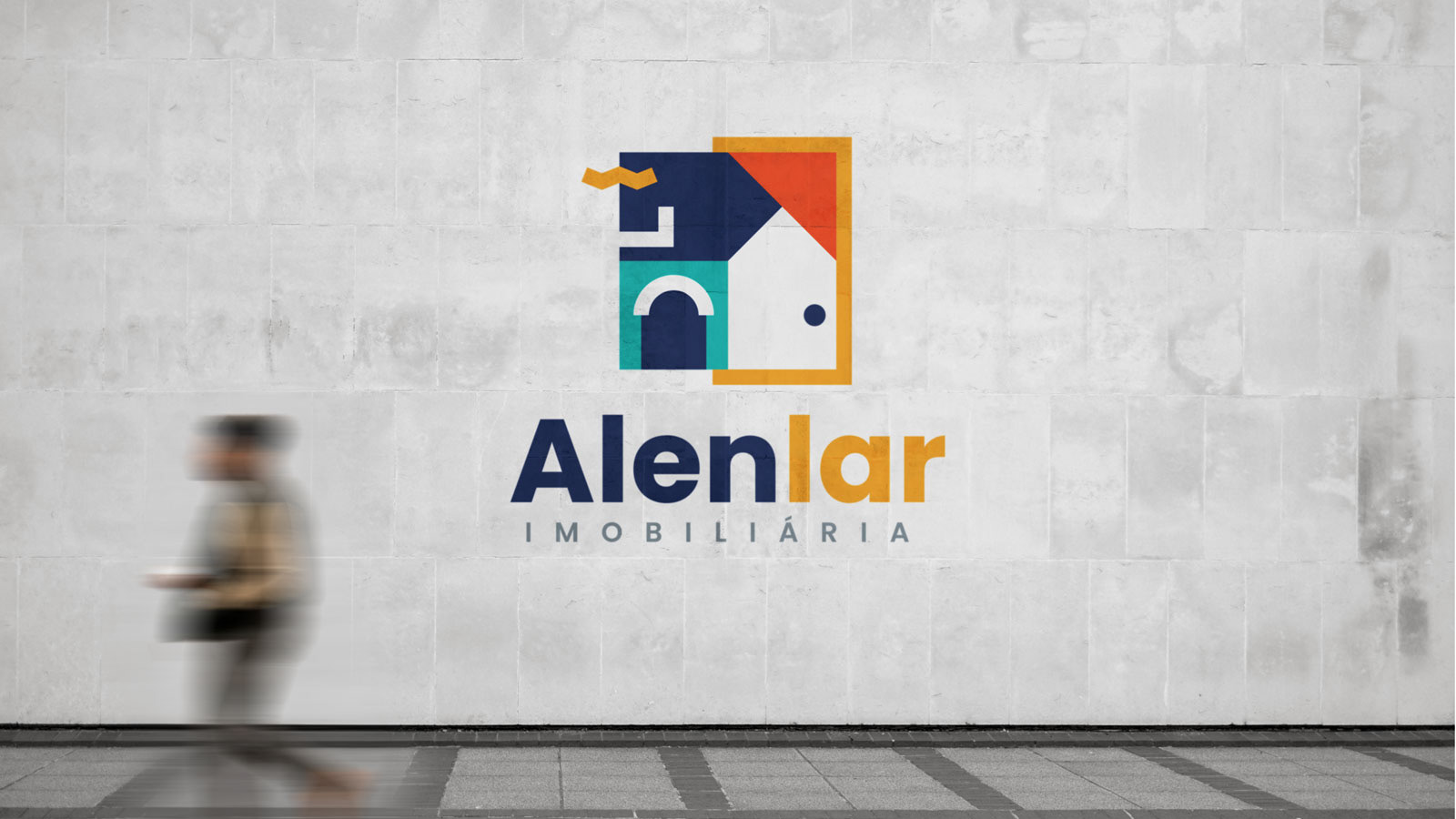
ALENLAR
Creative Rationale
The brand logo comes to respond to a saturated and without differentiating alternatives, with a young and fresh language, ready to arrive, see and win.
I created a representative name with simple iconography but shocking. We allow the origin to be defined but with the ability to grow gradually and freely. The real estate company's name brings in its etymology structuring values: home, ring, loyal, real and the indication of commitment between two parties for a common goal of happiness, dream, and fulfillment.
Colors are the living complement where emotions grow and pass sensations and ways of being, we use colors with energy, passion, sensuality, confidence, security, transition and prestige.


Thanks for viewing the work. A beautiful day for everyone.
www.alenlar.com